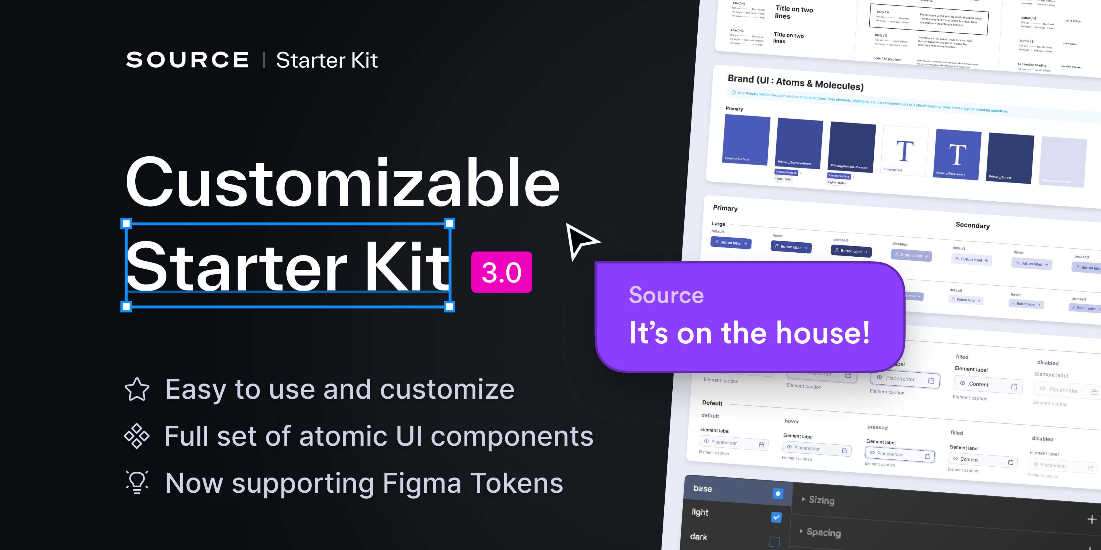
Enhance project industrialization with a reusable, configurable, and dev-ready starter kit
Project done while working at Source Interactive
TL;DR
I know your time is scarce

Why a Starter Kit?
Two main goals : kickstart projects, train apprentices
Re-creating color systems, basic components and documentation each time a project is delivered is a tedious and un-interesting work.
BUT, as customer needs are many, delivering the same UI Kit for all projects is also impossible.
The Starter Kit allows to kickstart ANY project, for ANY customer, with a 100% customable fundation system and documented atoms.
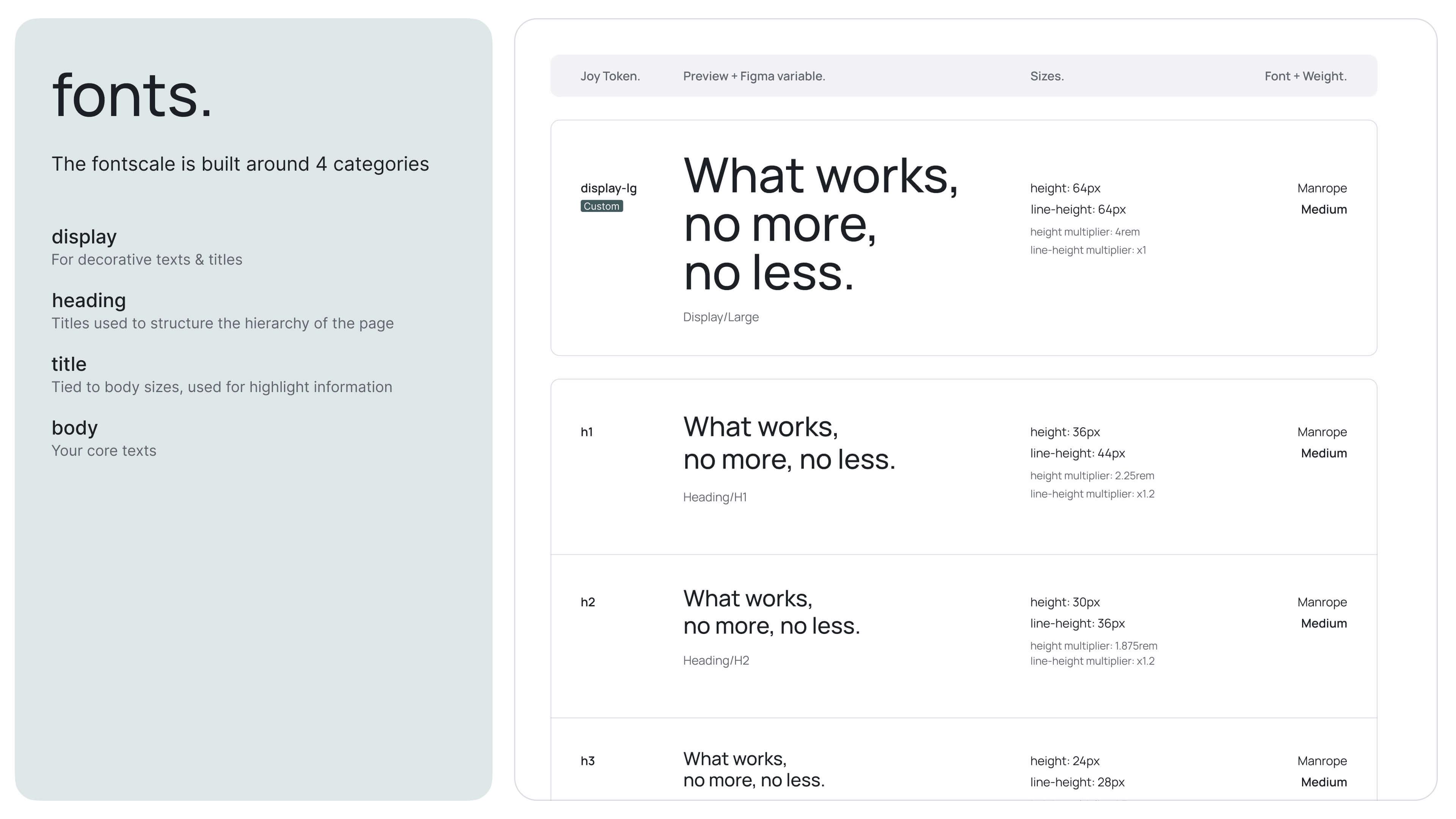
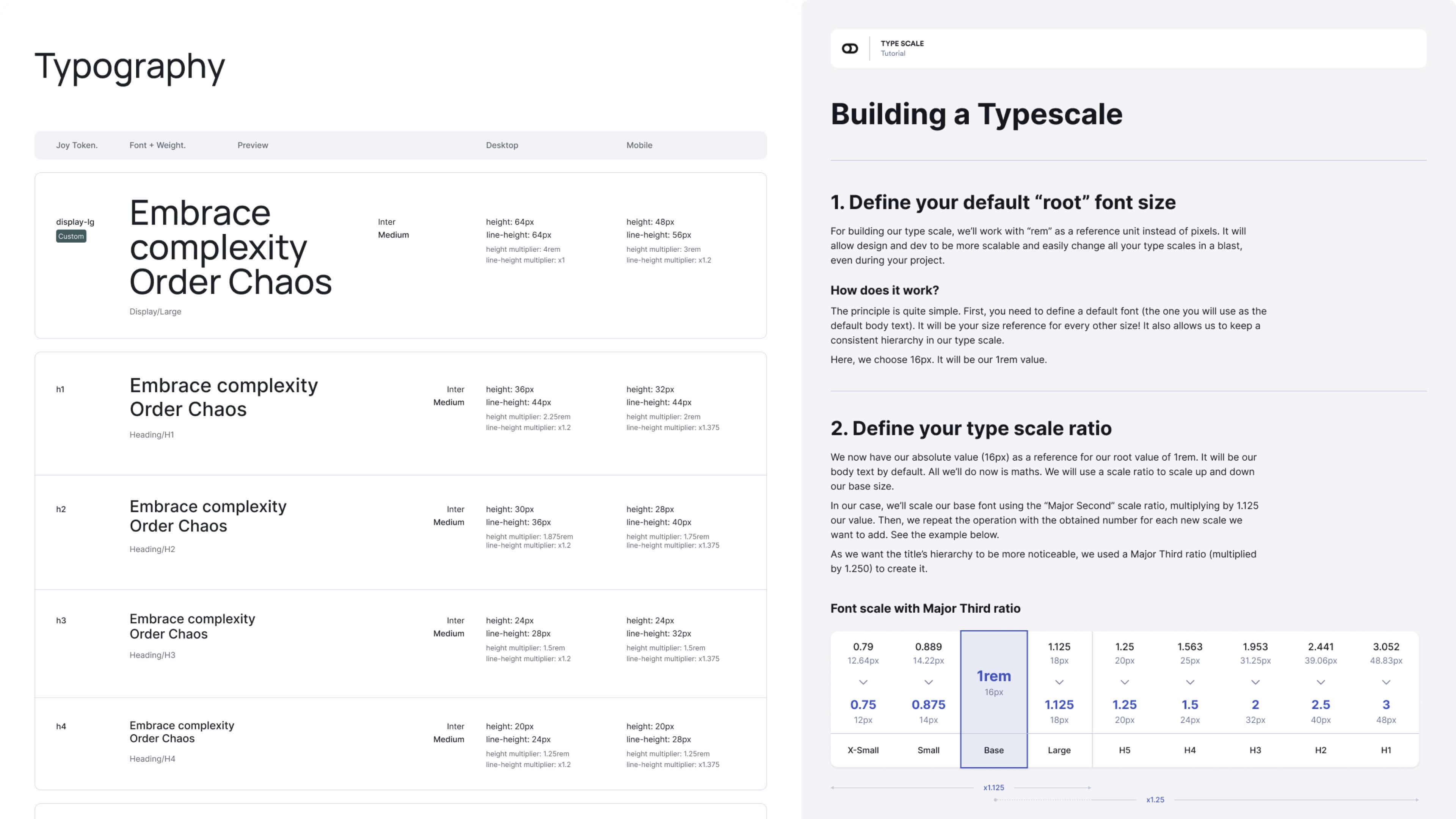
Our fundations
Exploring Color, Font and Sizing systems
and how to implement them in Figma.
We explored many options through the 4 versions of the Starter Kit, following ~2 years of Figma updates and needs from our tech team.
The middle ground between customization efficiency and ease of use has been quite hard to find, esp. in a team of 20+ designers with various preferences and Figma proficiency.
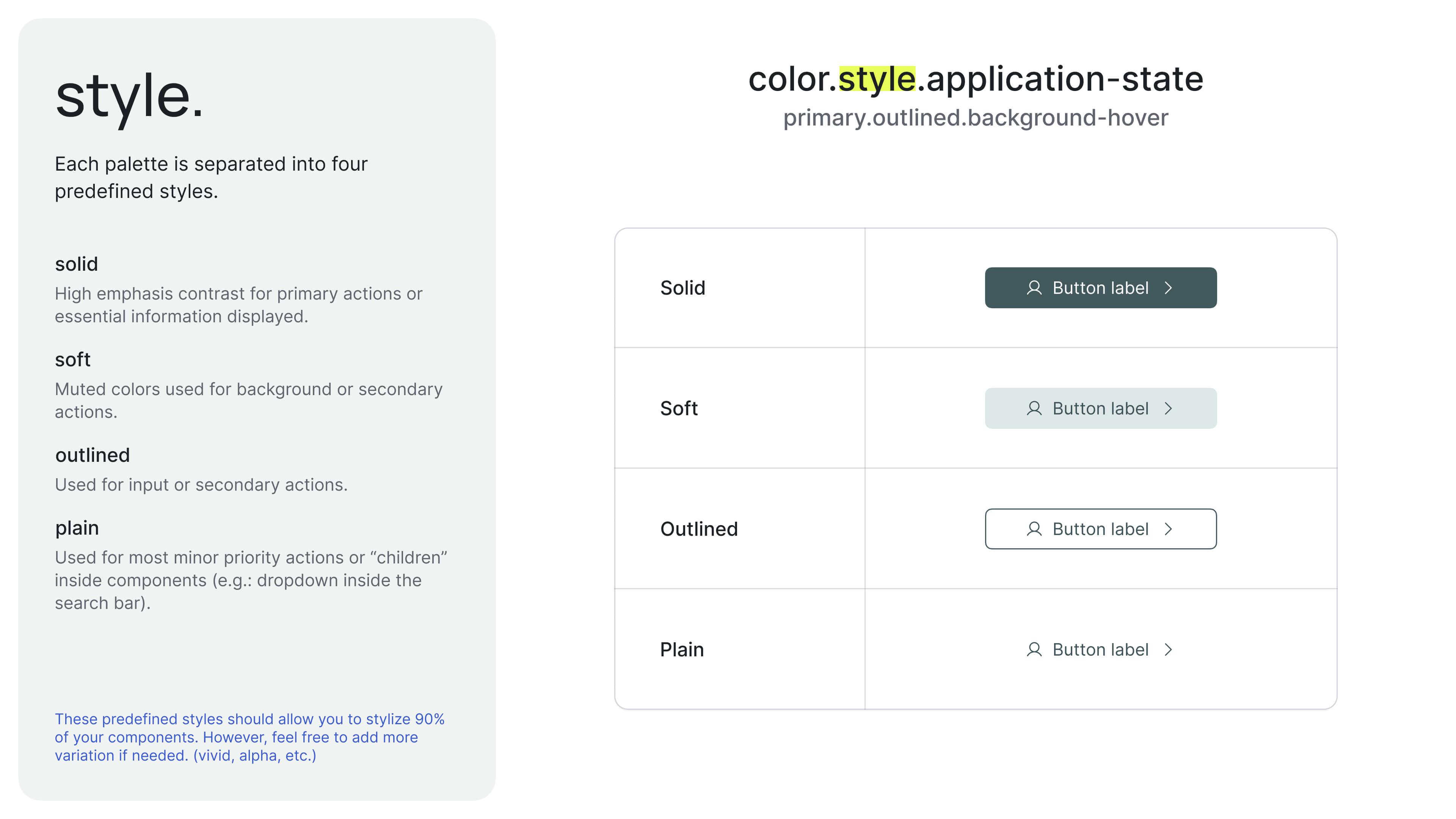
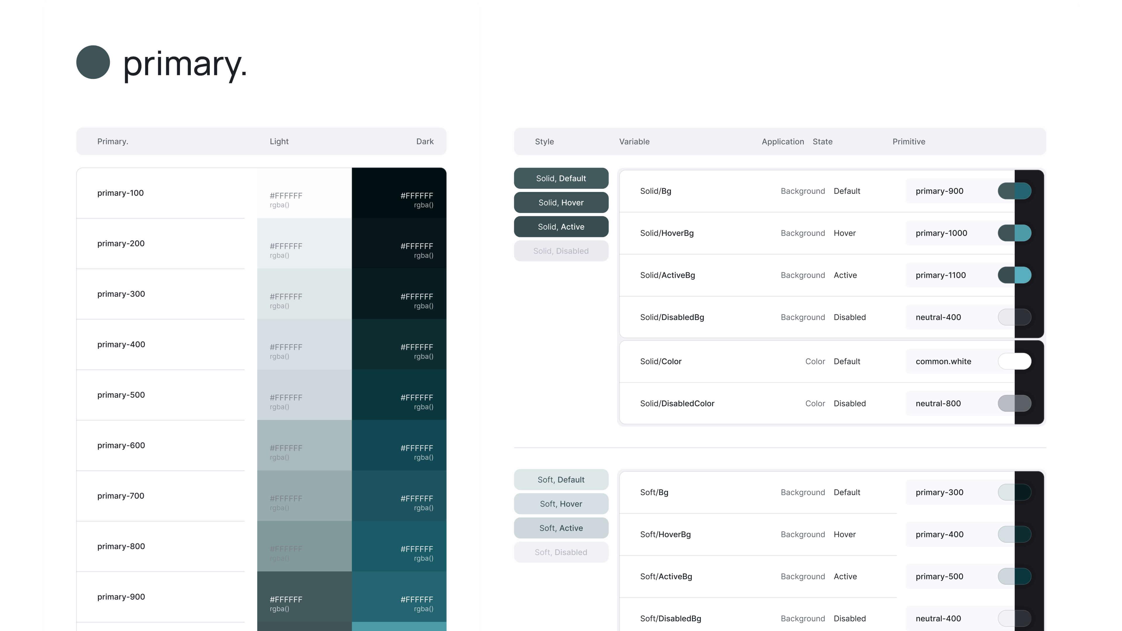
Our last version settled on a collection of Primitives, plugged to contextual style Variables applied to components.
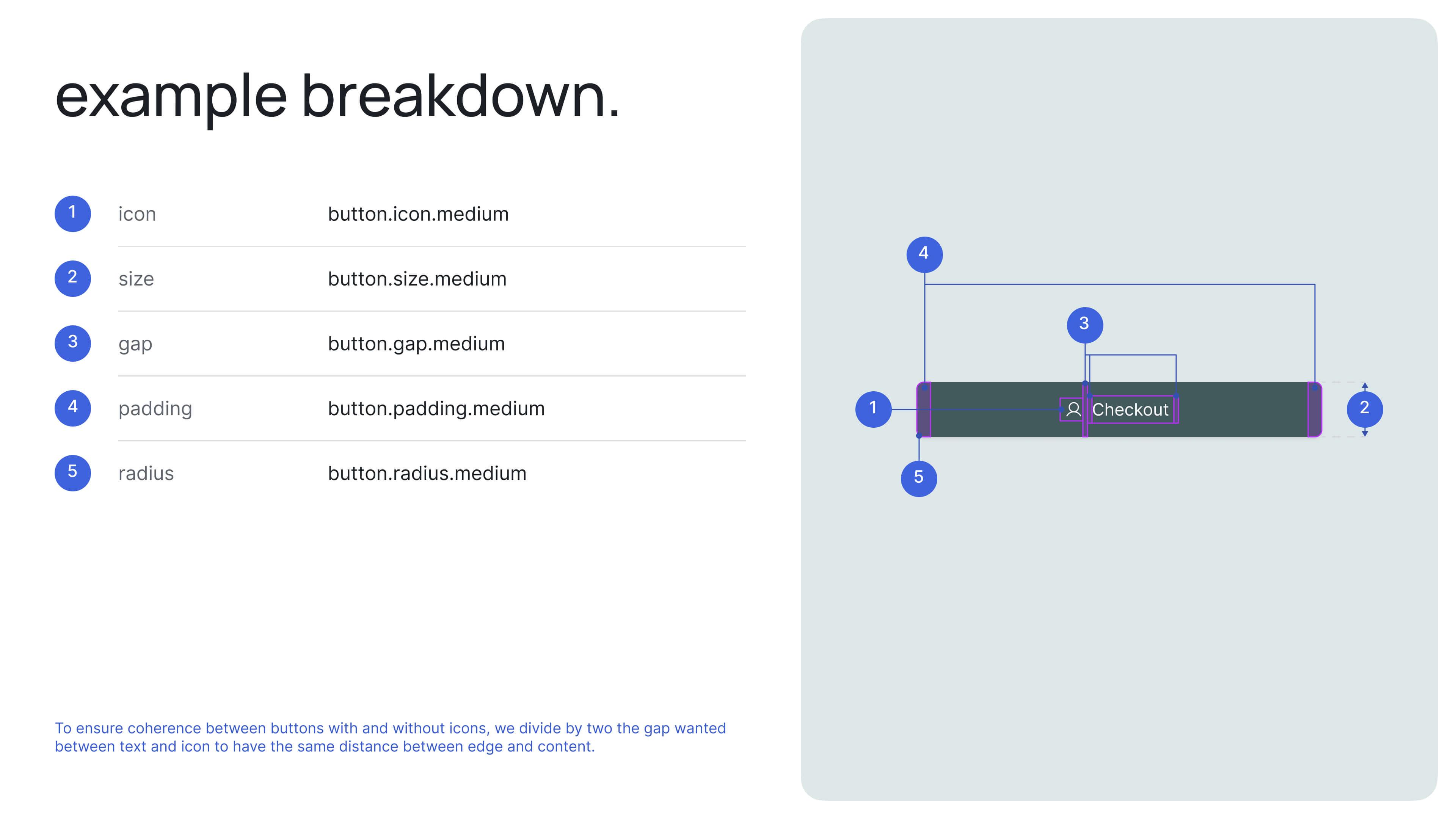
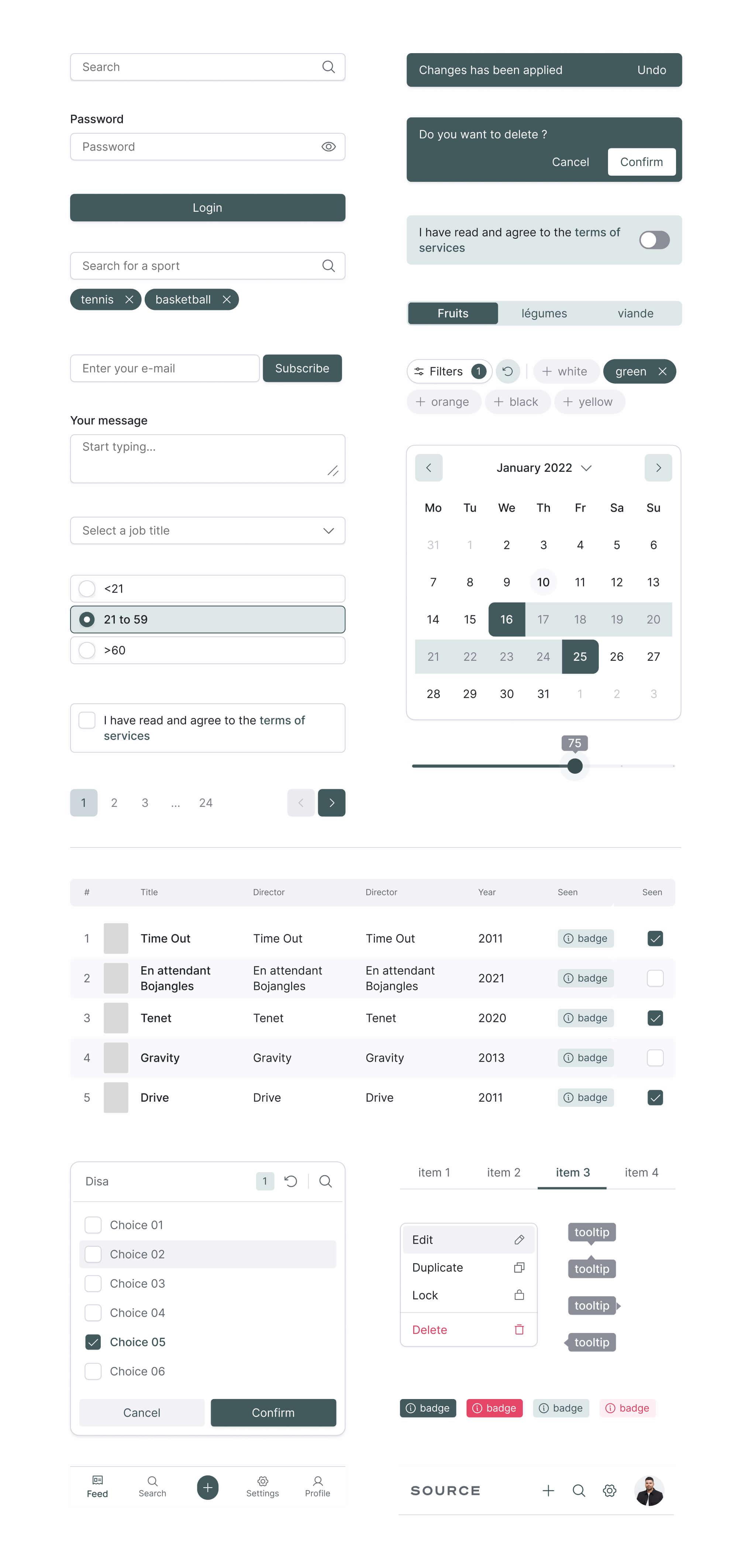
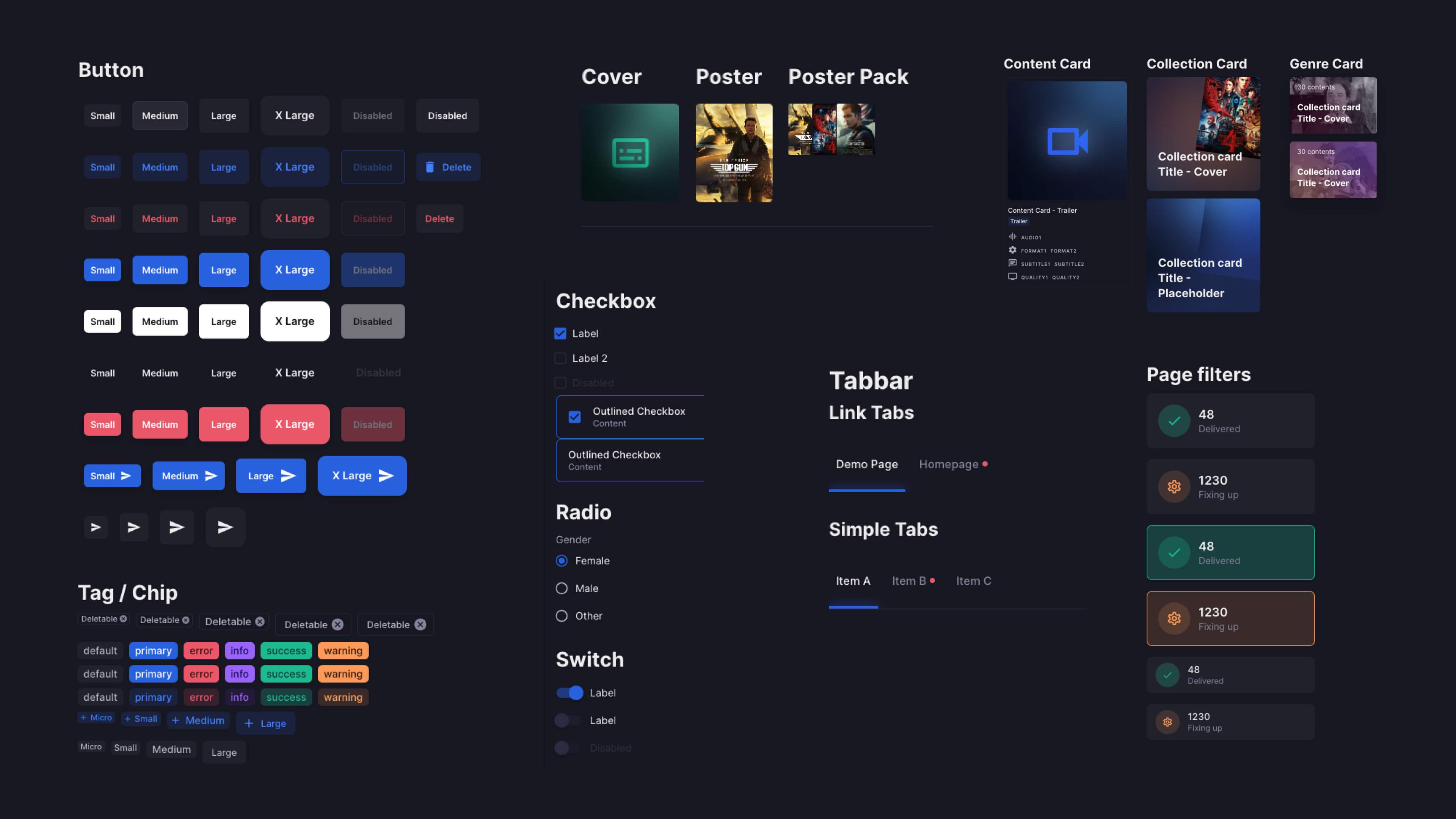
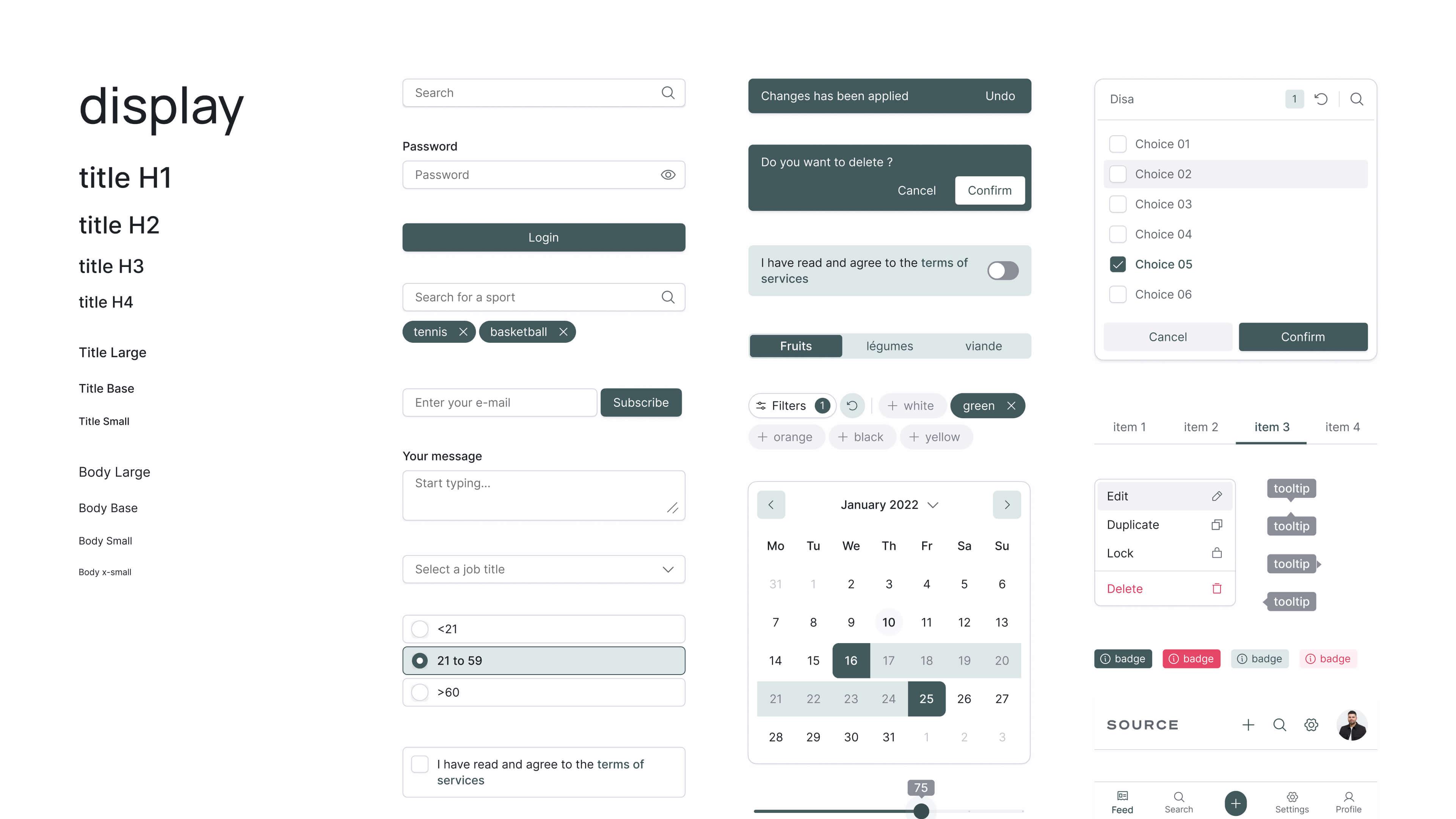
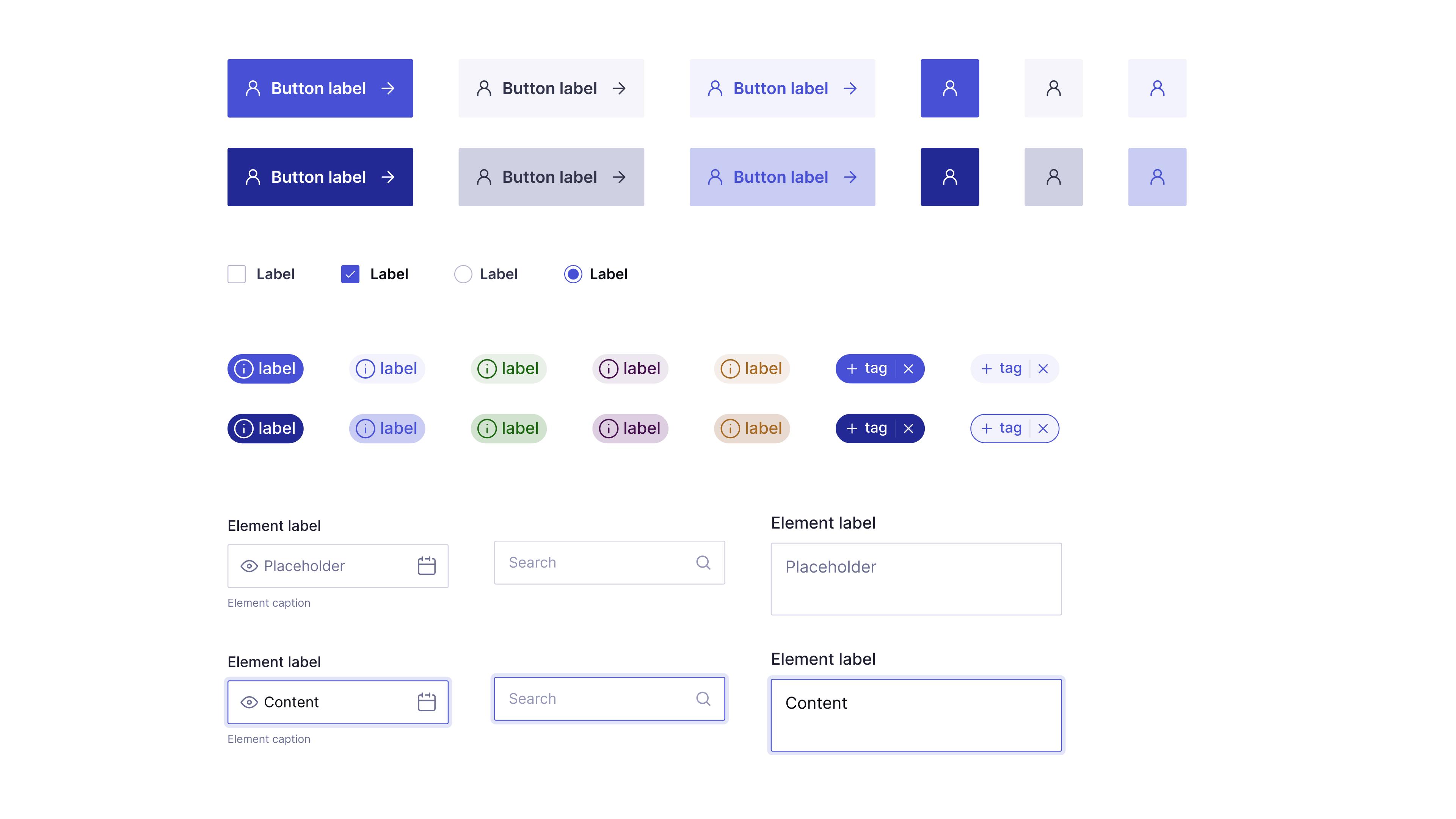
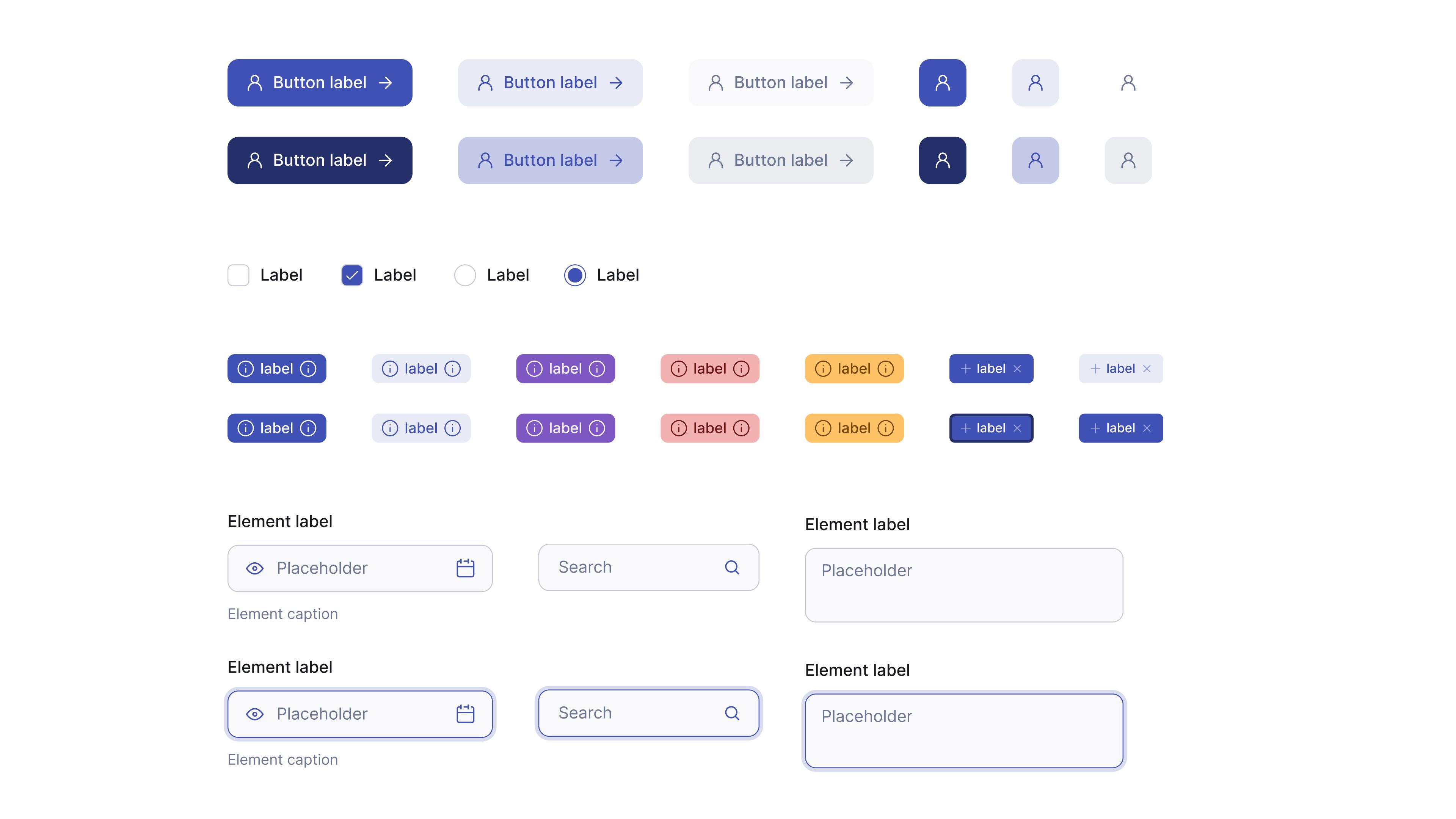
Building blocks
Clean, re-usable, easy to customize atoms.
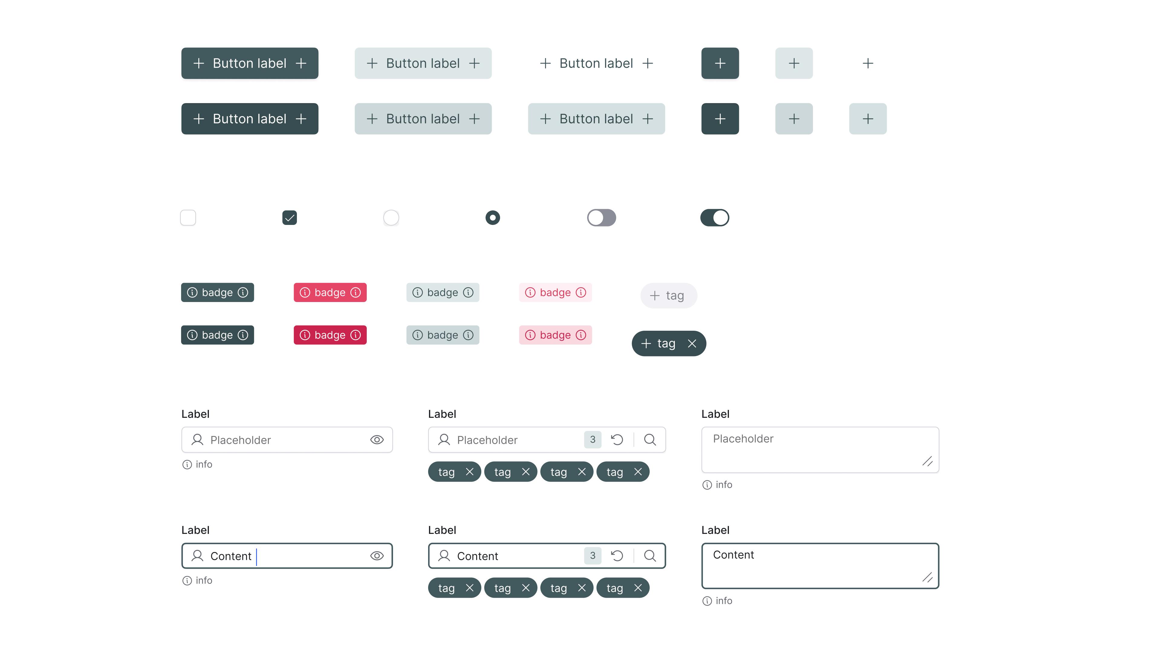
Building components in Figma has changed a lot since 2020.
The Starter Kit started before the Properties feature, and has seen many quality of life updates since Properties and Variables have been released.
To follow the "starter" philosophy, the Kit only features basic building blocks : buttons, inputs, etc.
The SK2 — Properties + Token Studios is available in the Figma community.
A brand new look & feel for a powerful SaaS