Revamping a complex product to industry standards
Project done while working at Source Interactive
TL;DR
I know your time is scarce
Research
Understanding how the current product works,
who uses it, why, and how.
Our work started with discovering the platform, understanding its users and their needs.
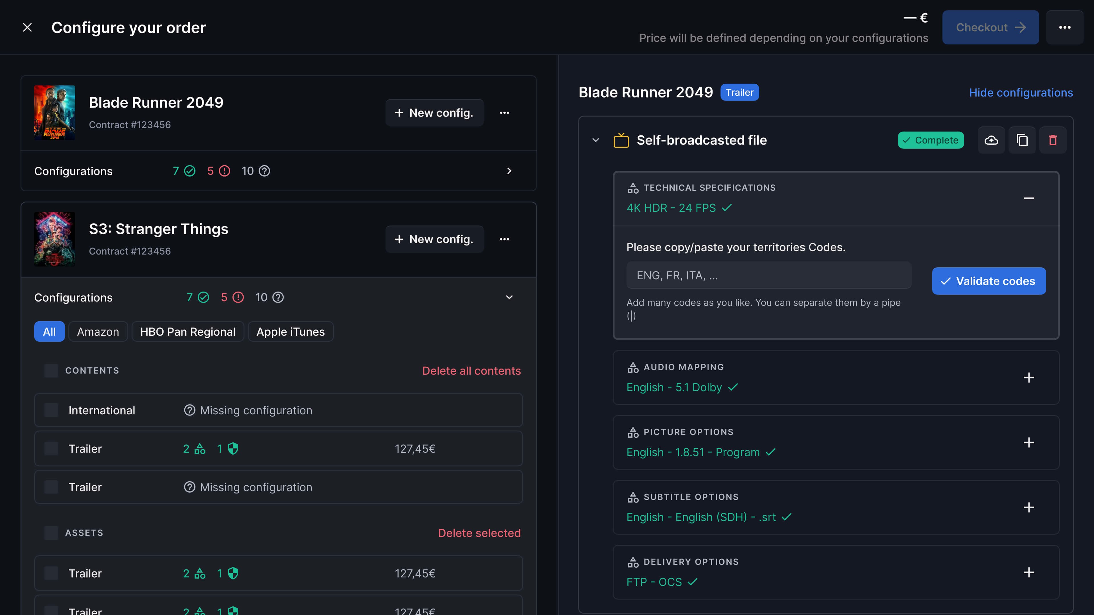
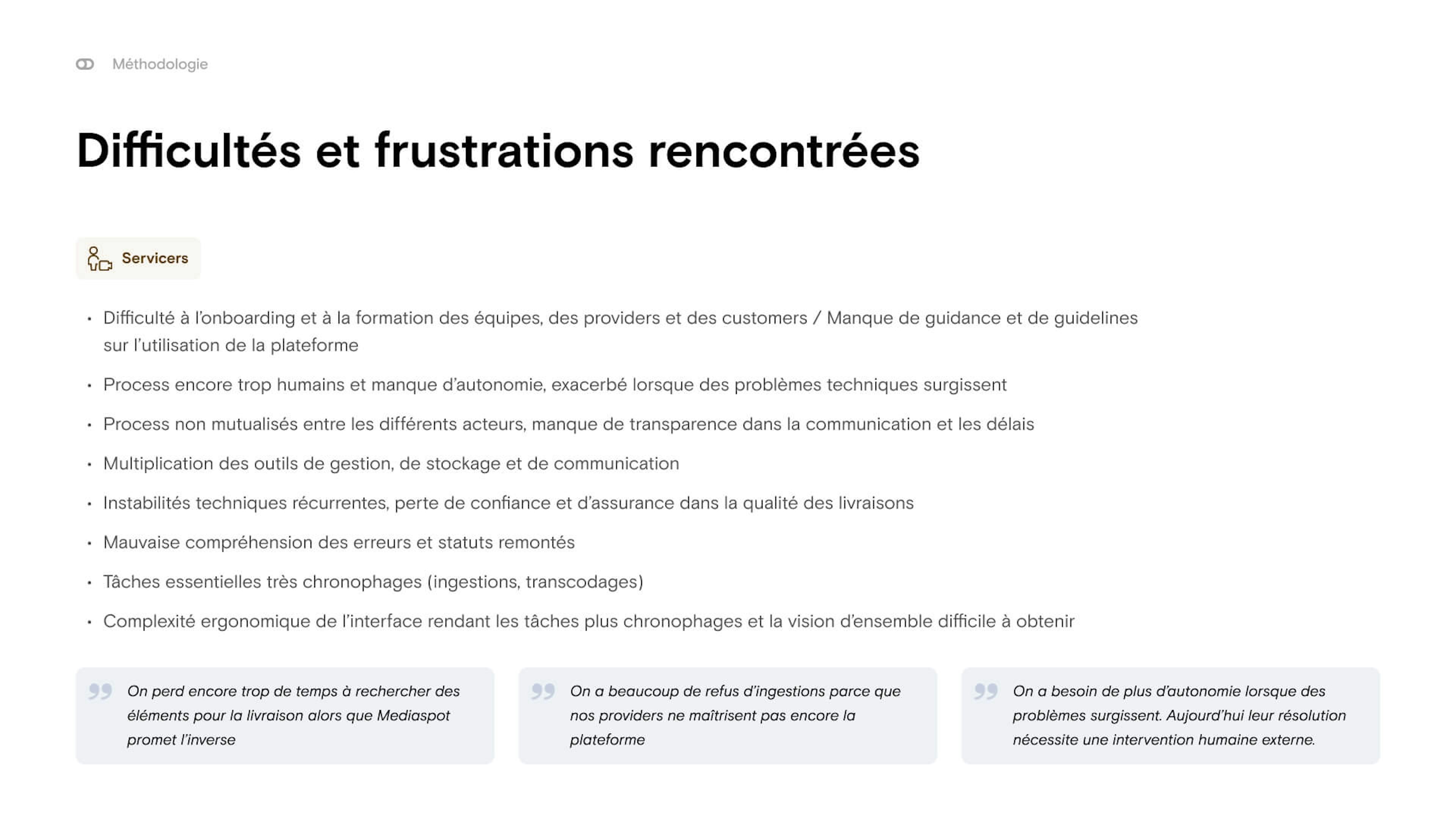
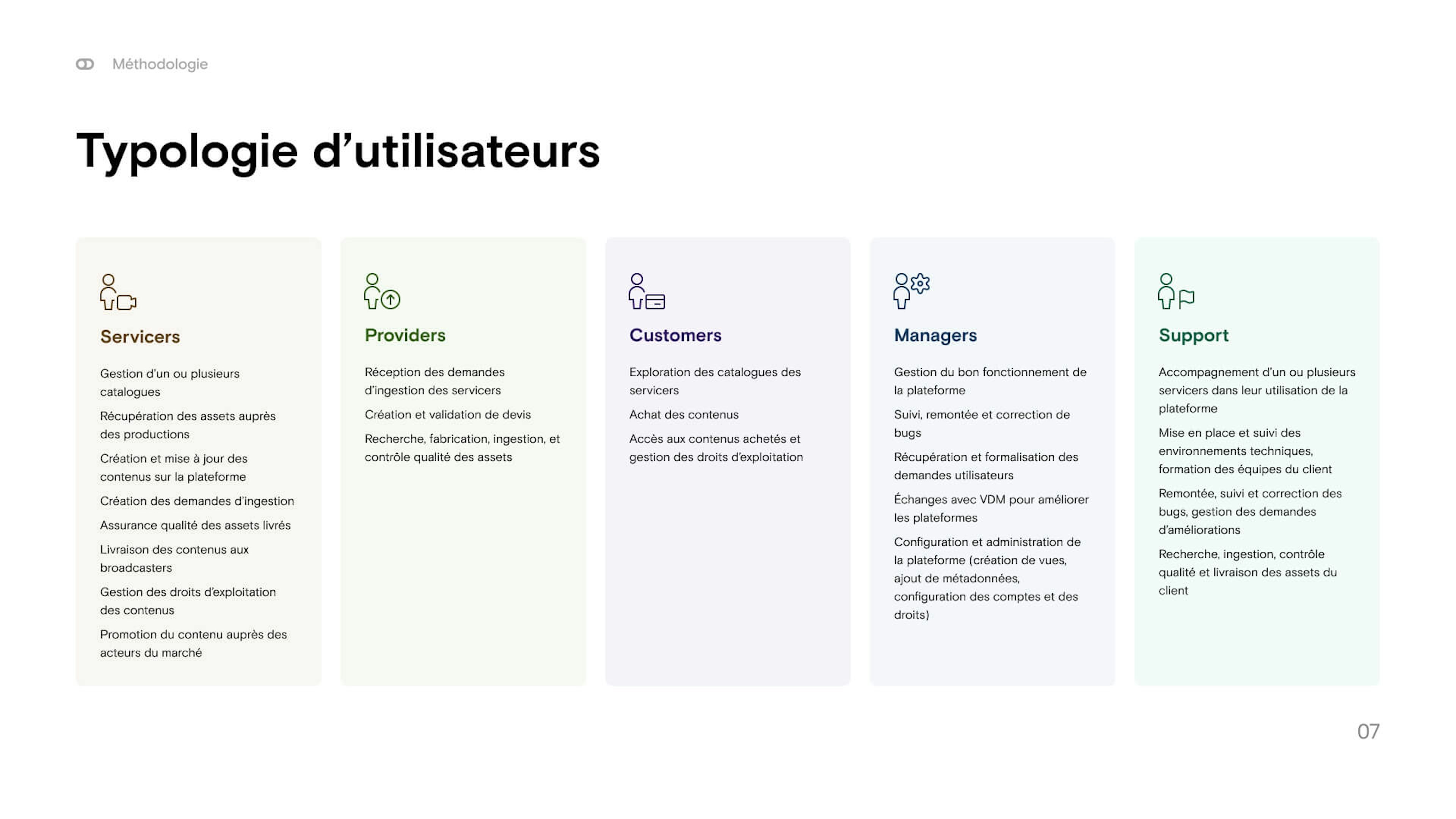
We conducted several interviews with different user types: customers, mediaspot teams, C-levels at famous broadcasting companies, video technicians, etc.
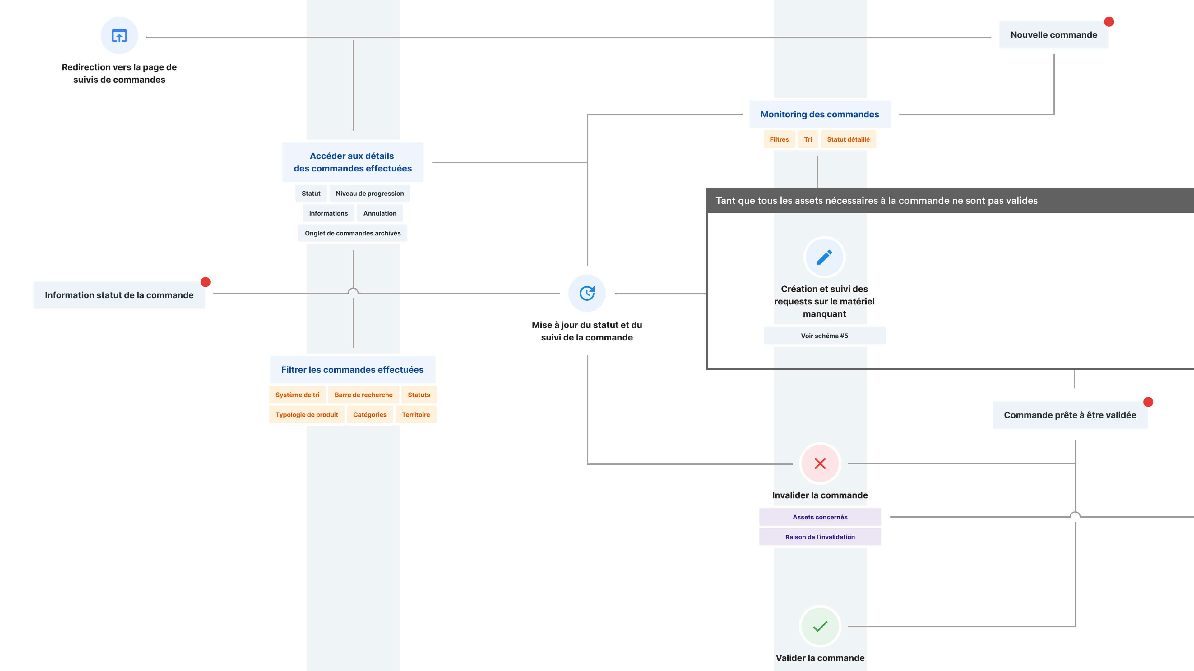
We extracted needs and pains from their verbatims, and translated them in a massive diagram representing various userflows on the platform : creating media, reviewing content, requesting assets, etc.
Wireframing & UI
Translating our vision into a modern and powerful interface
without losing any feature in the process.
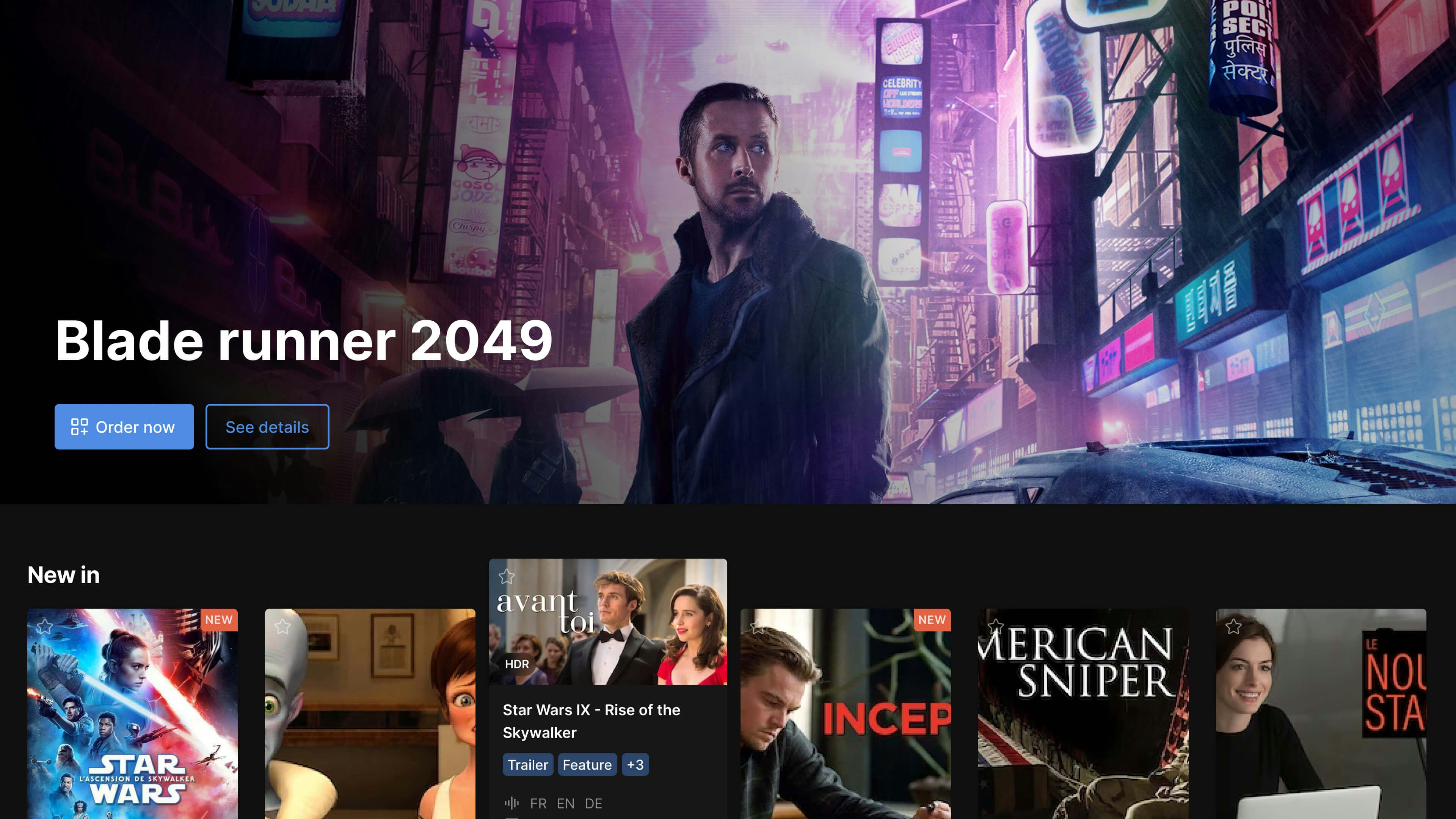
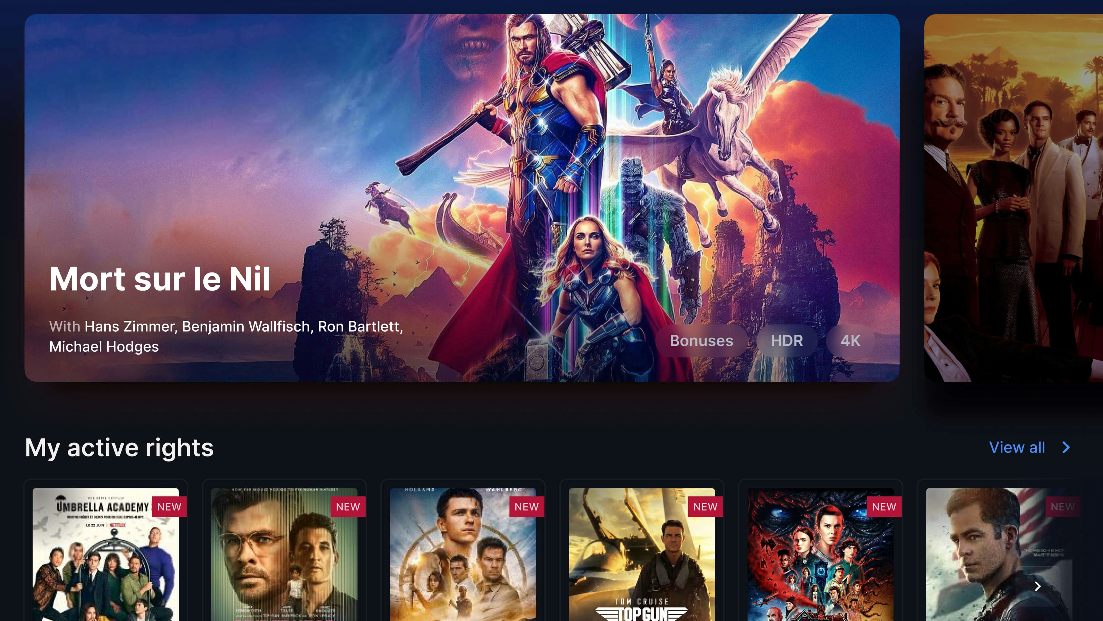
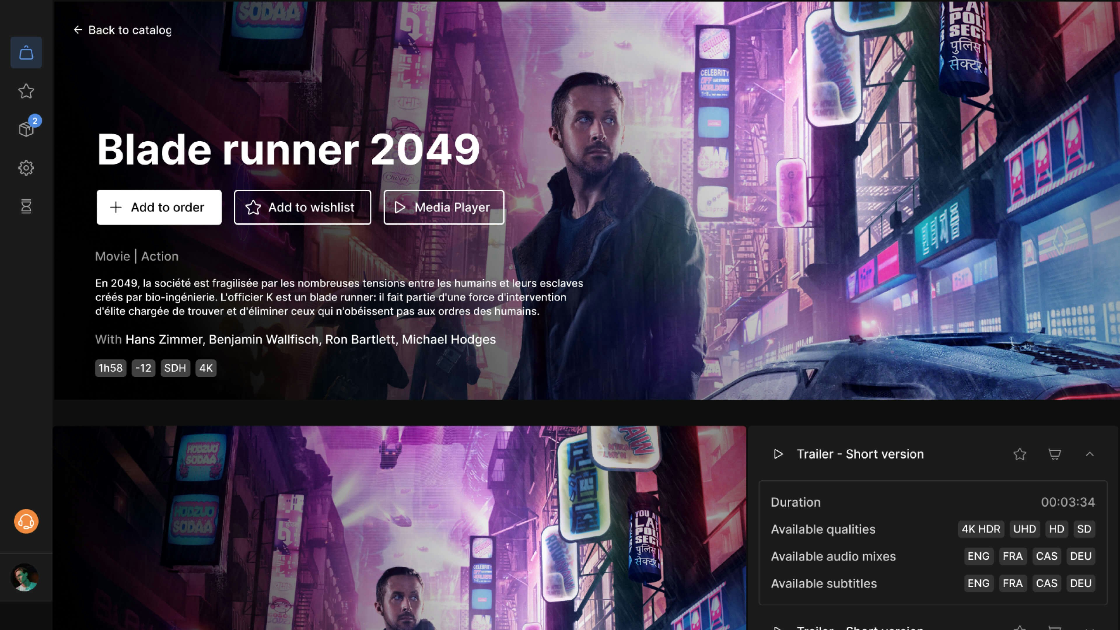
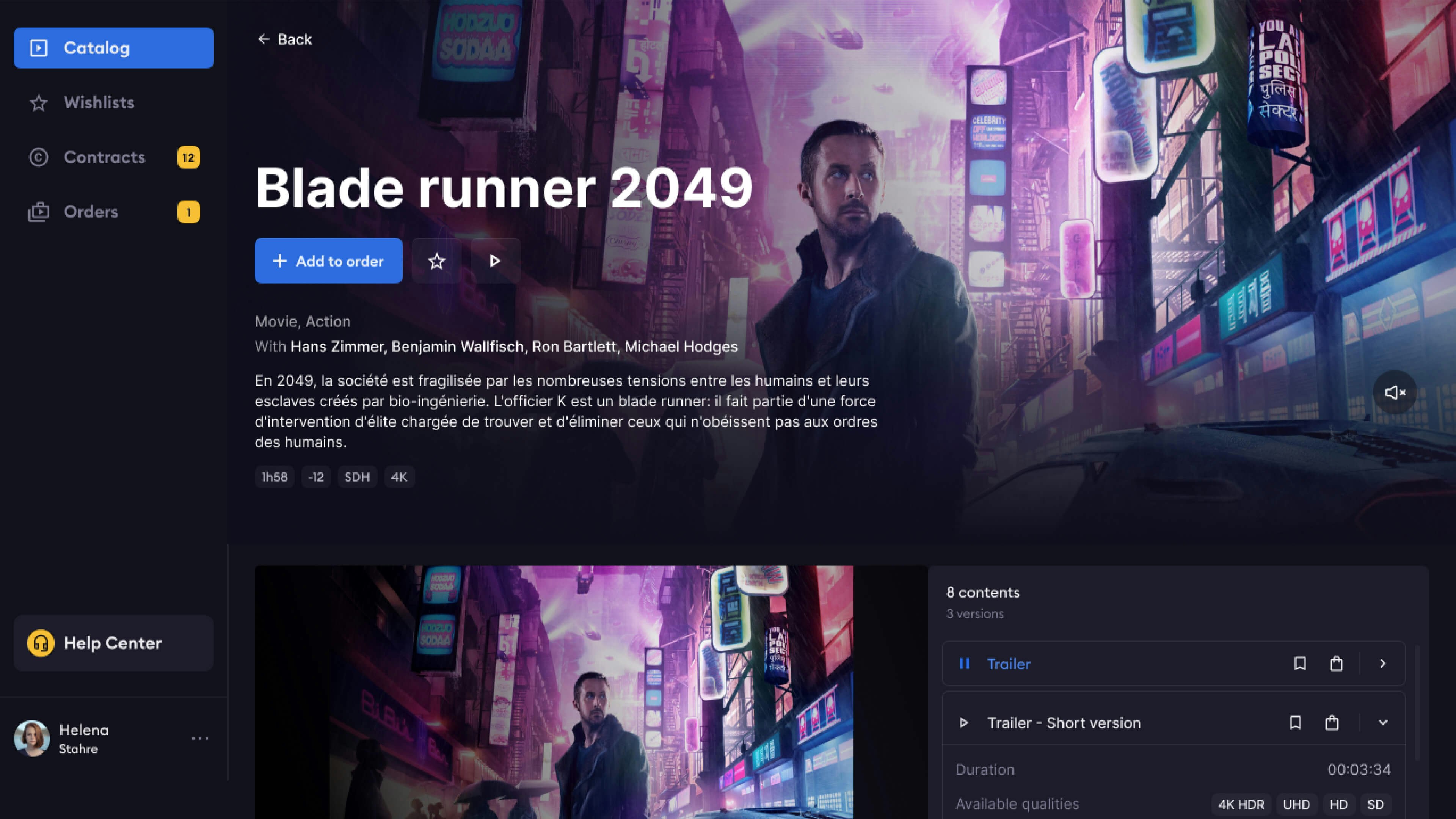
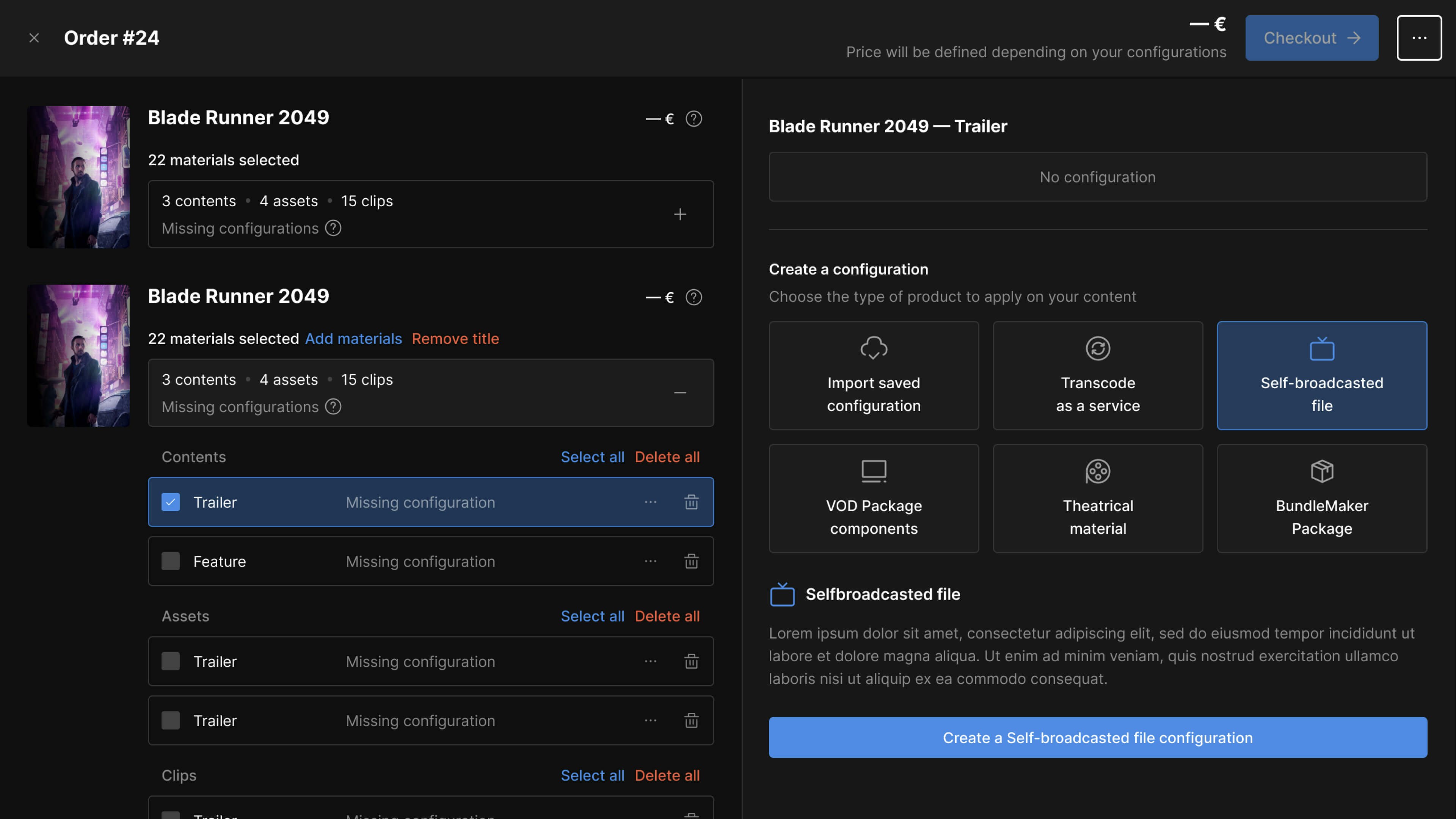
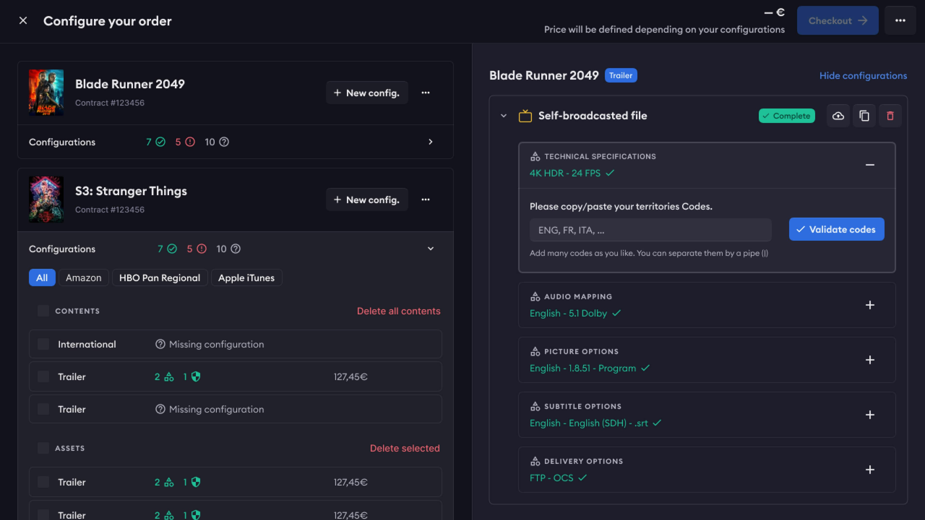
Once we had a good vision of the platform features, we started wireframing.
Thanks to our Starter Kit, we settled on building UI-frames, allowing our interfaces to get a first look & feel without compromising on velocity.
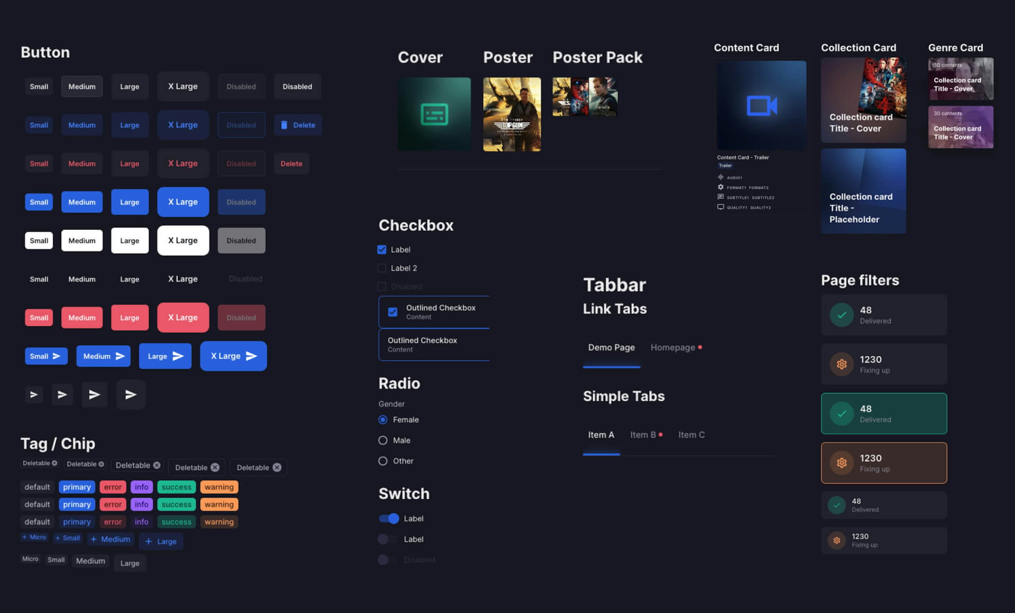
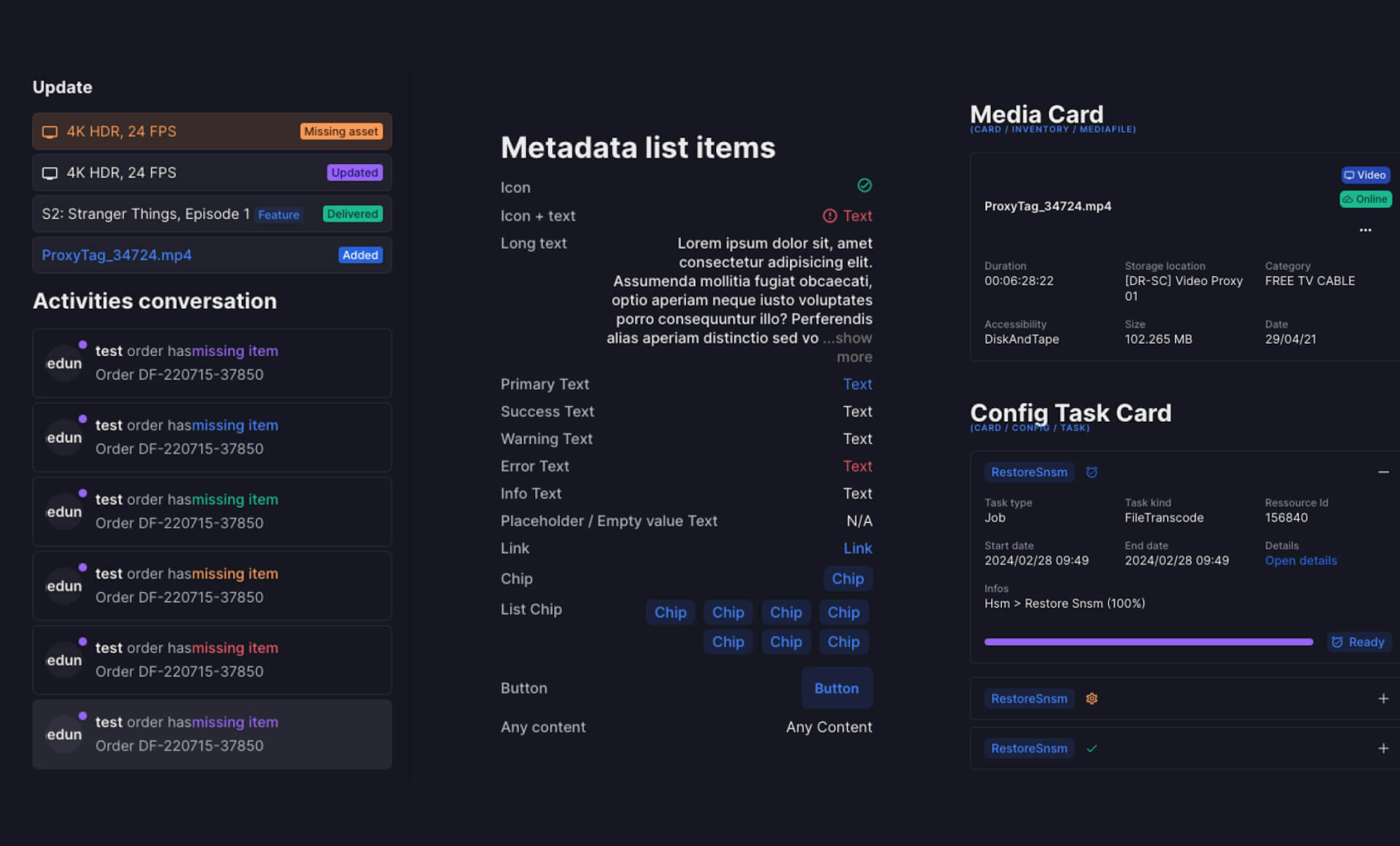
With a clear and shared vision, we refined and extended our UI choices to the whole UI kit.
Scaling, Front-end & QA
Developing a delightful interface based on
solid and customable fundations.
We tailored our UI kit knowing we would use the MUI front-end framework.
It allowed our front-end team a quick access to quality components and helpers, taking a huge amount of work off the table (interactions, responsiveness, etc.)
The direct link between our kit and the front-end allowed for the easiest QA process I’ve ever witnessed, as well as a simplified light / dark mode implementation a year later.
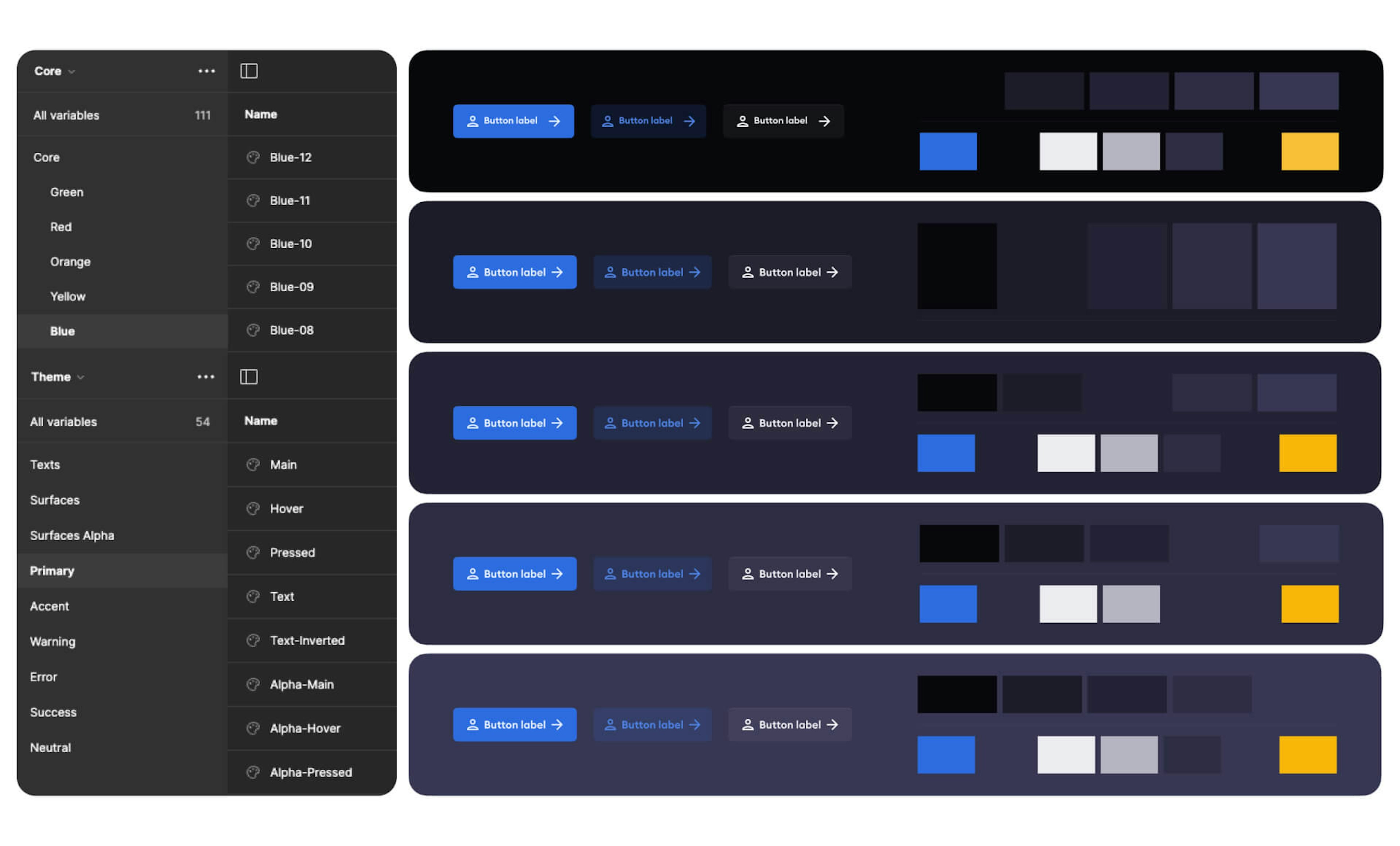
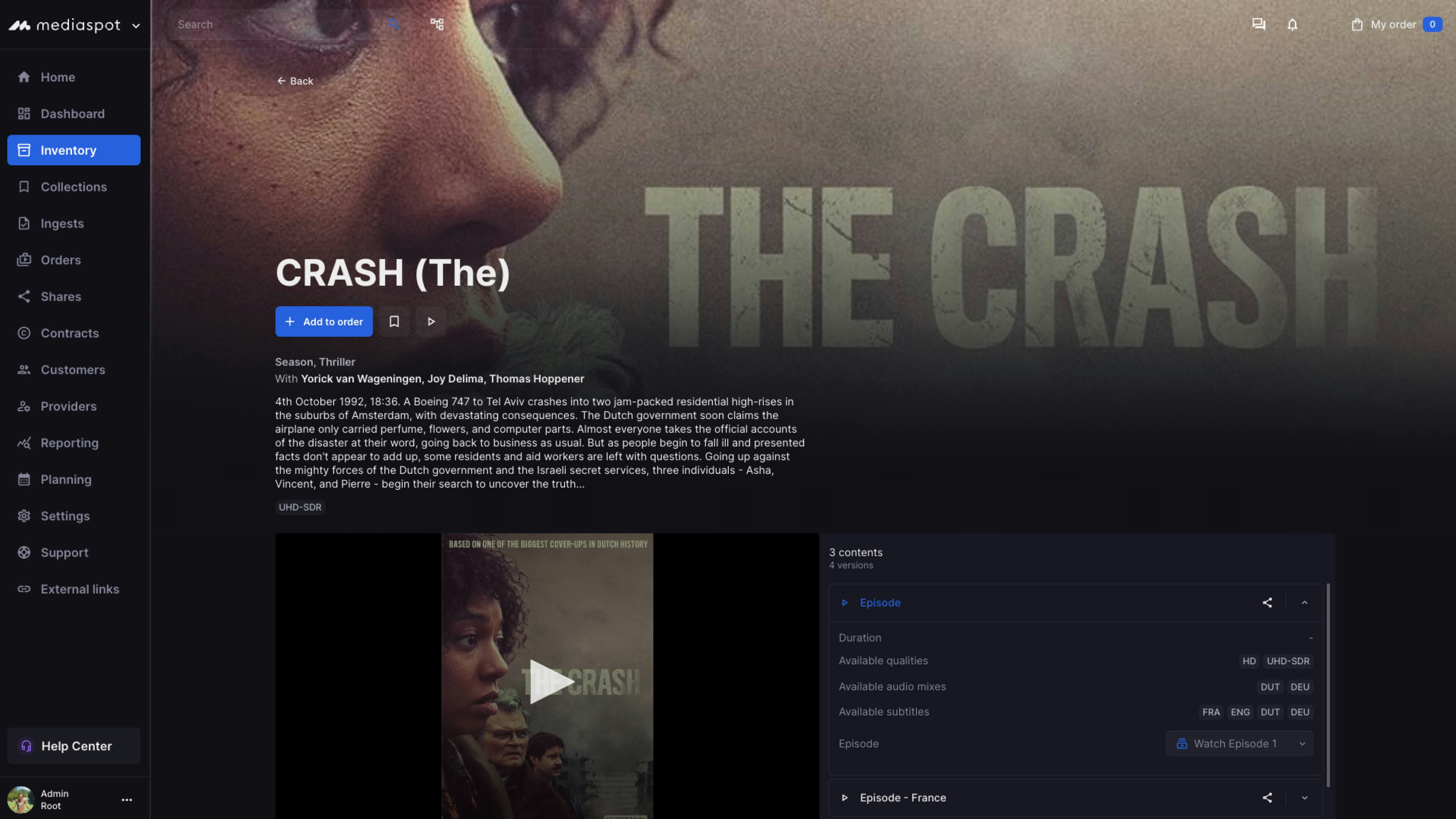
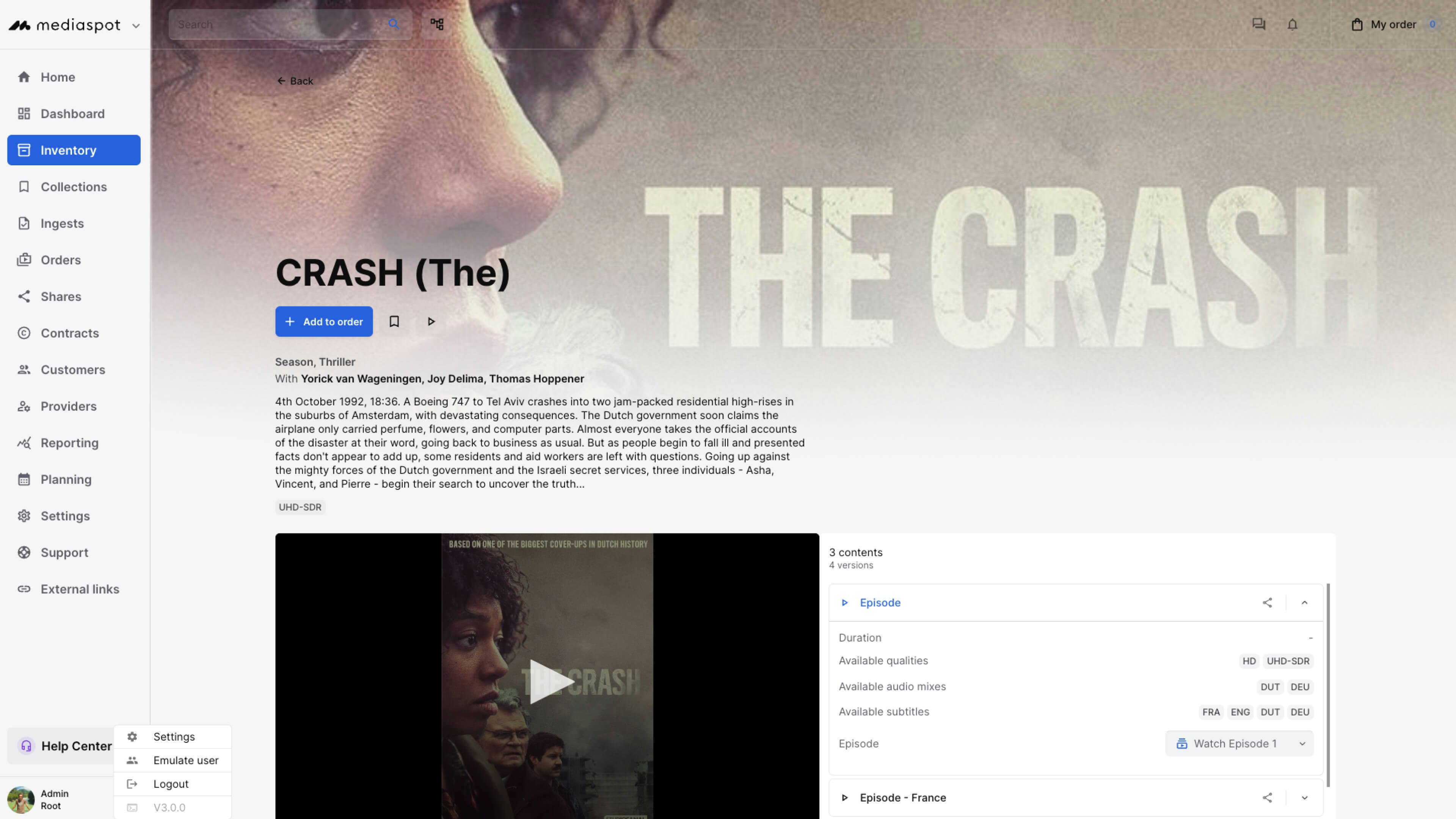
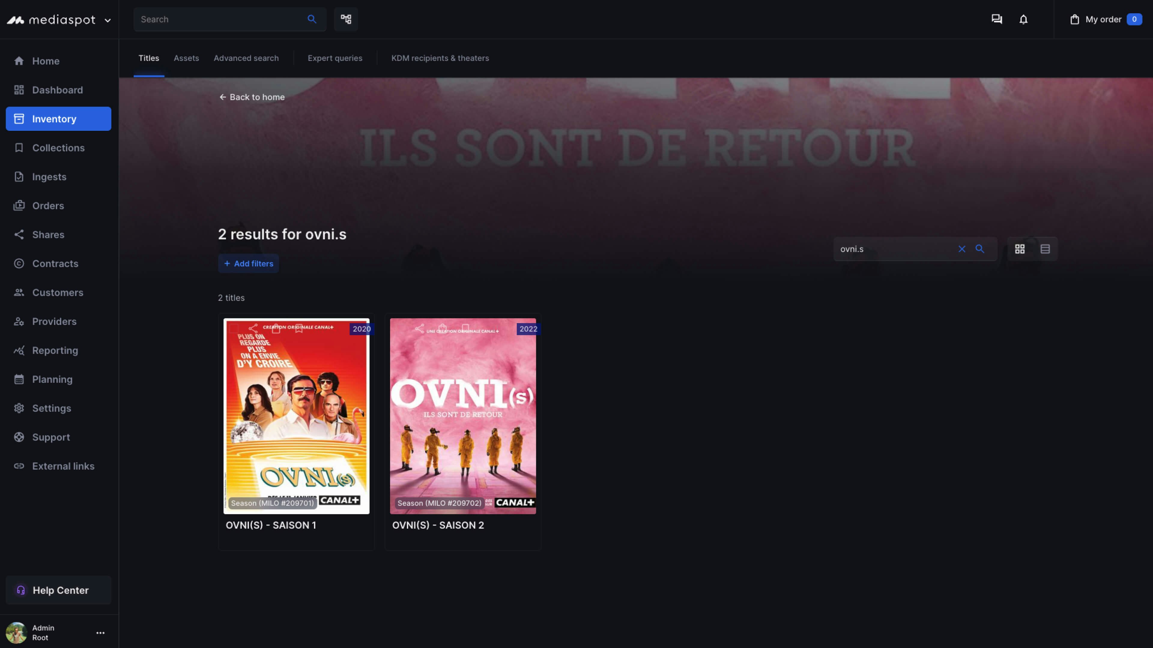
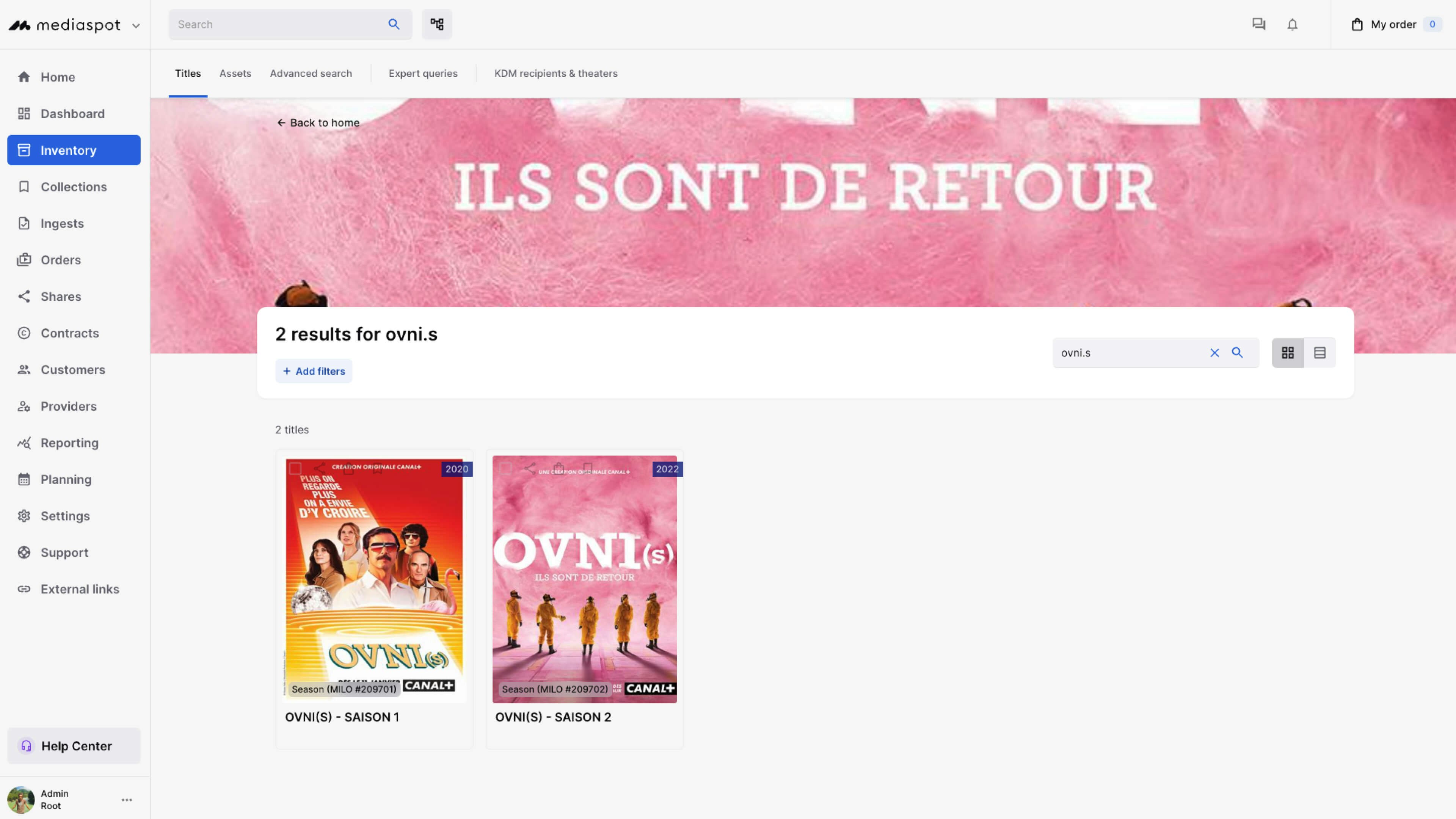
A year after the first delivery, the client came back to us requesting a light mode.
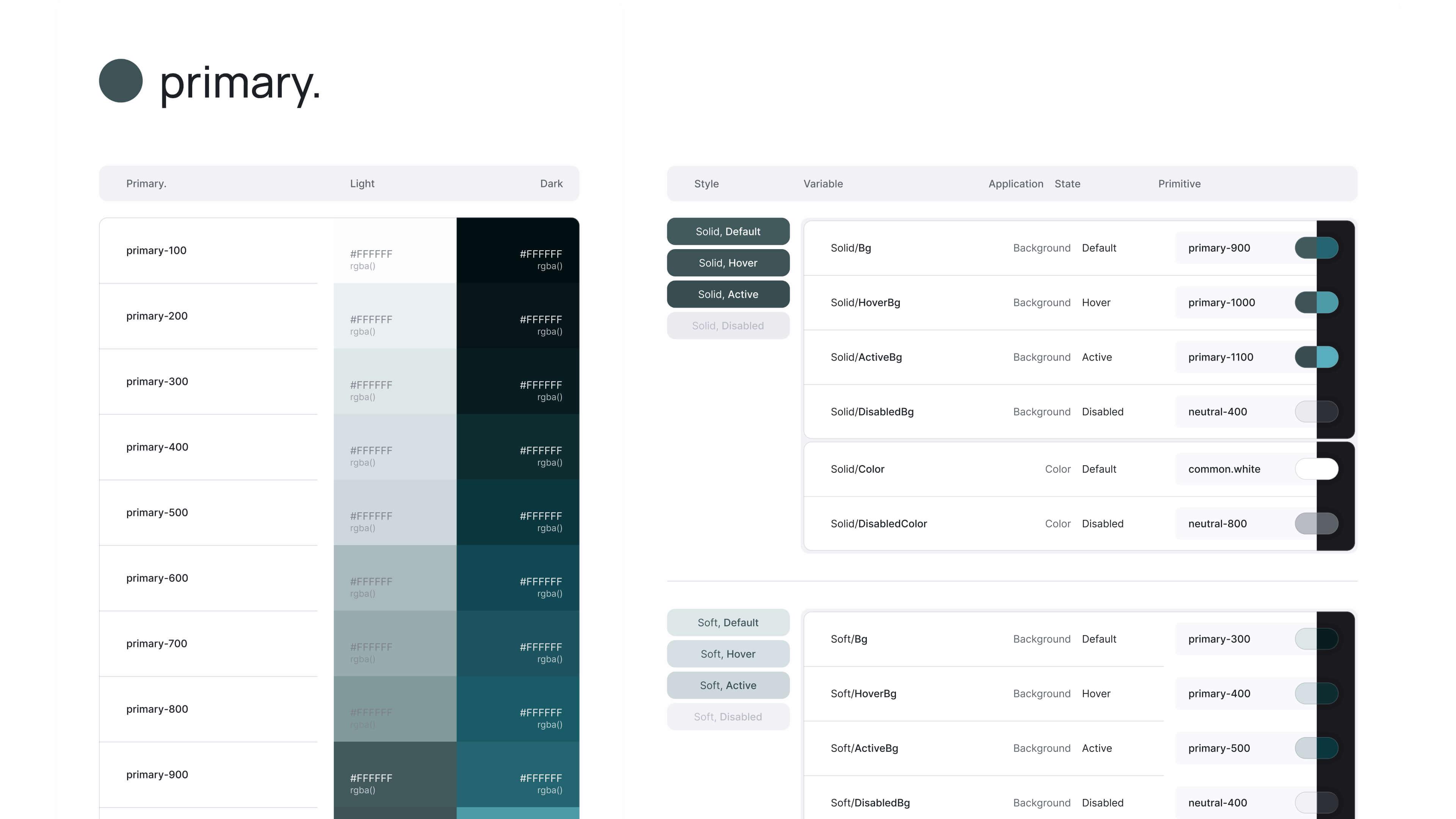
Thanks to our powerful color system, this work was almost transparent for designers.
It was as simple as finding a light value for each of our contextual colors, and voila!
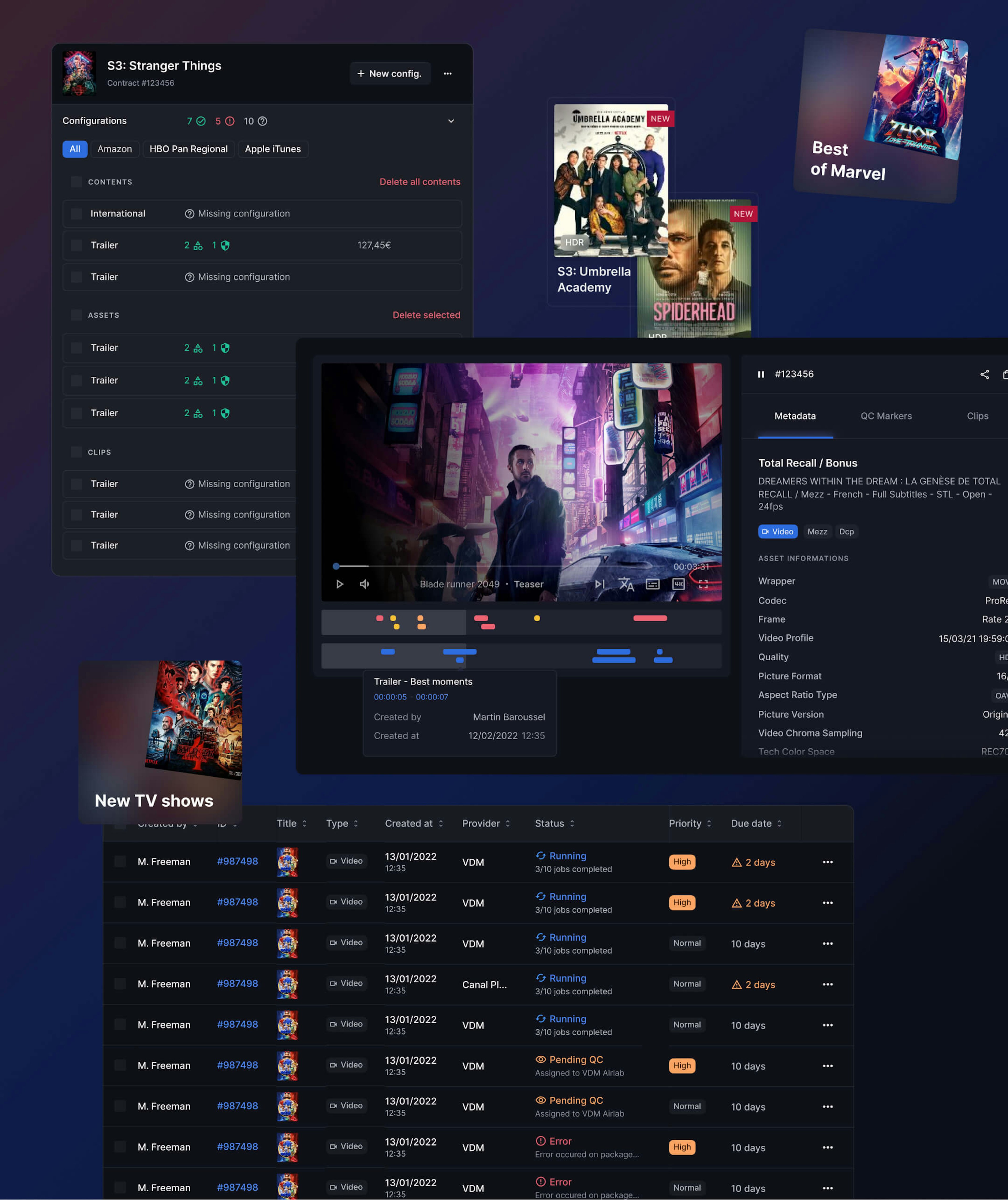
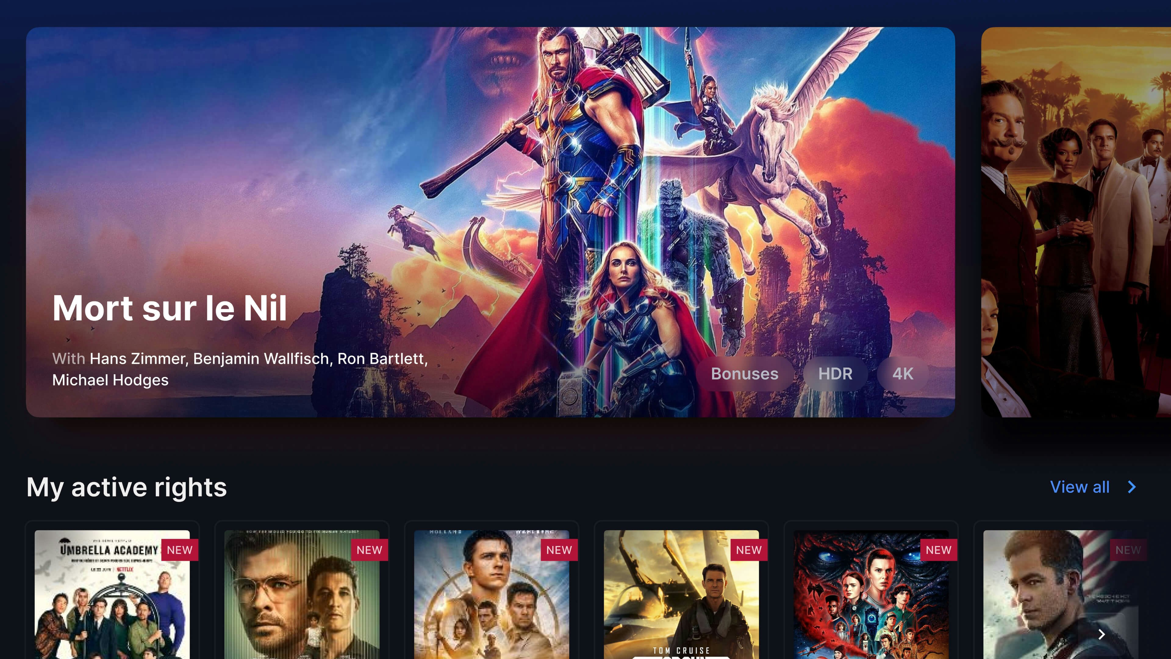
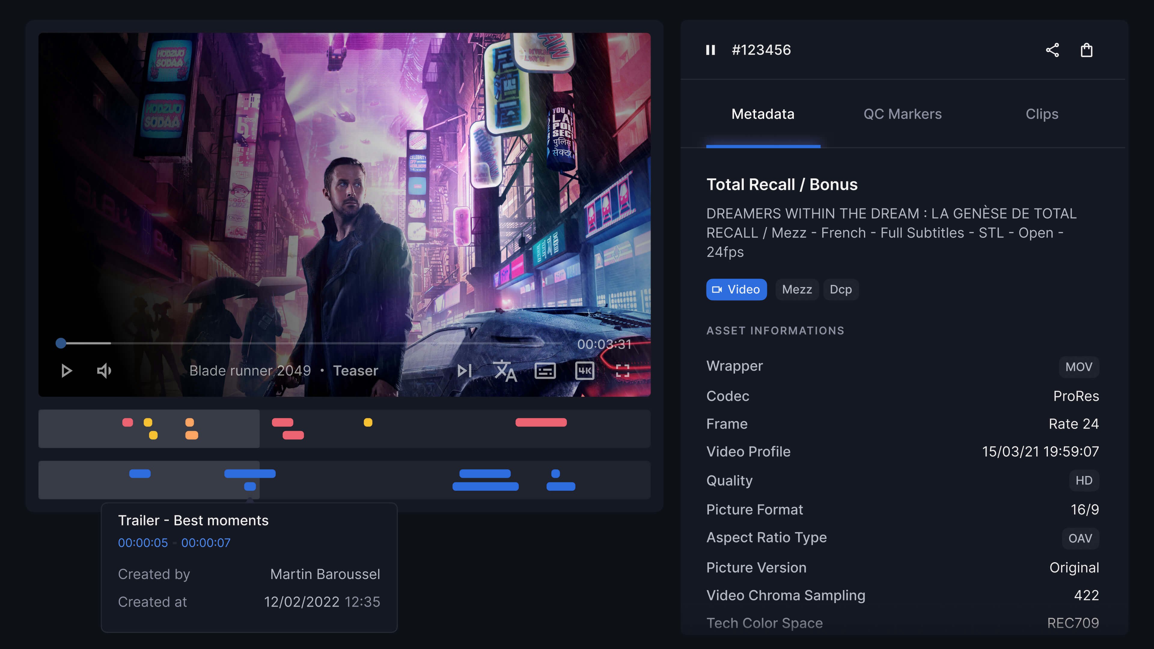
A brand new look & feel for a powerful SaaS
Enhance project industrialization with a reusable, configurable, and dev-ready starter kit
